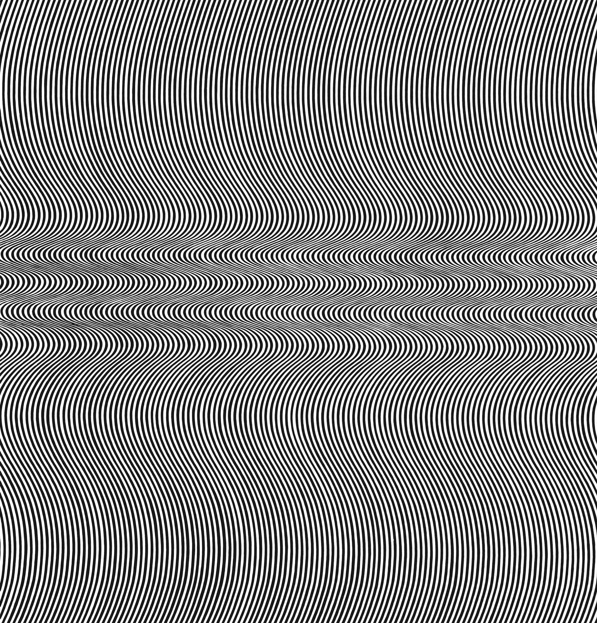
The Yale Center for British Art holds four works on paper by Bridget Riley. One is a vibrant screen print of dynamic shapes called Blue and Pink (2001), a gift made in 2012 by John Elderfield, a former curator at the Museum of Modern Art (MoMA), and his wife, Jeanne Collins, an art publicist (fig. 1).(1) This print, the most recent work by Riley in the YCBA's collection, is the outcome of a finely honed printmaking practice that has now spanned some six decades.

(Fig. 1) Bridget Riley, Blue and Pink, 2001
The other three works at the museum harken back to an earlier time in Riley’s career: these include two studies in gouache over graphite for Red and Blue (1969) and Orpheus, study 6 (1977), and the screen print Untitled [Rose] (1978). This trio was gifted to the museum by the British art critic John Russell in 2001.(2)
Russell spent much of his life in the United States. After moving to New York in 1974, he worked for the New York Times until he retired in 1990. But it was through his earlier career in London at the Sunday Times—where he enjoyed a nearly thirty-year tenure, predominantly as the paper’s chief art critic—that he met many emerging British artists in the 1950s and 1960s, including Bridget Riley, Francis Bacon, Anthony Caro, David Hockney, and Howard Hodgkin. The art critic’s positive reviews helped artists like Riley burst onto the international art scene.
Russell not only wrote about Riley’s work but also supported her personally. On trips to New York City during and after her involvement in The Responsive Eye exhibition at MOMA in 1965, Russell introduced Riley to the city’s art scene. The two enjoyed a strong and lasting friendship, leading Riley to inscribe “For John Russell” in the bottom-right corner of her study for Red and Blue (fig. 2).
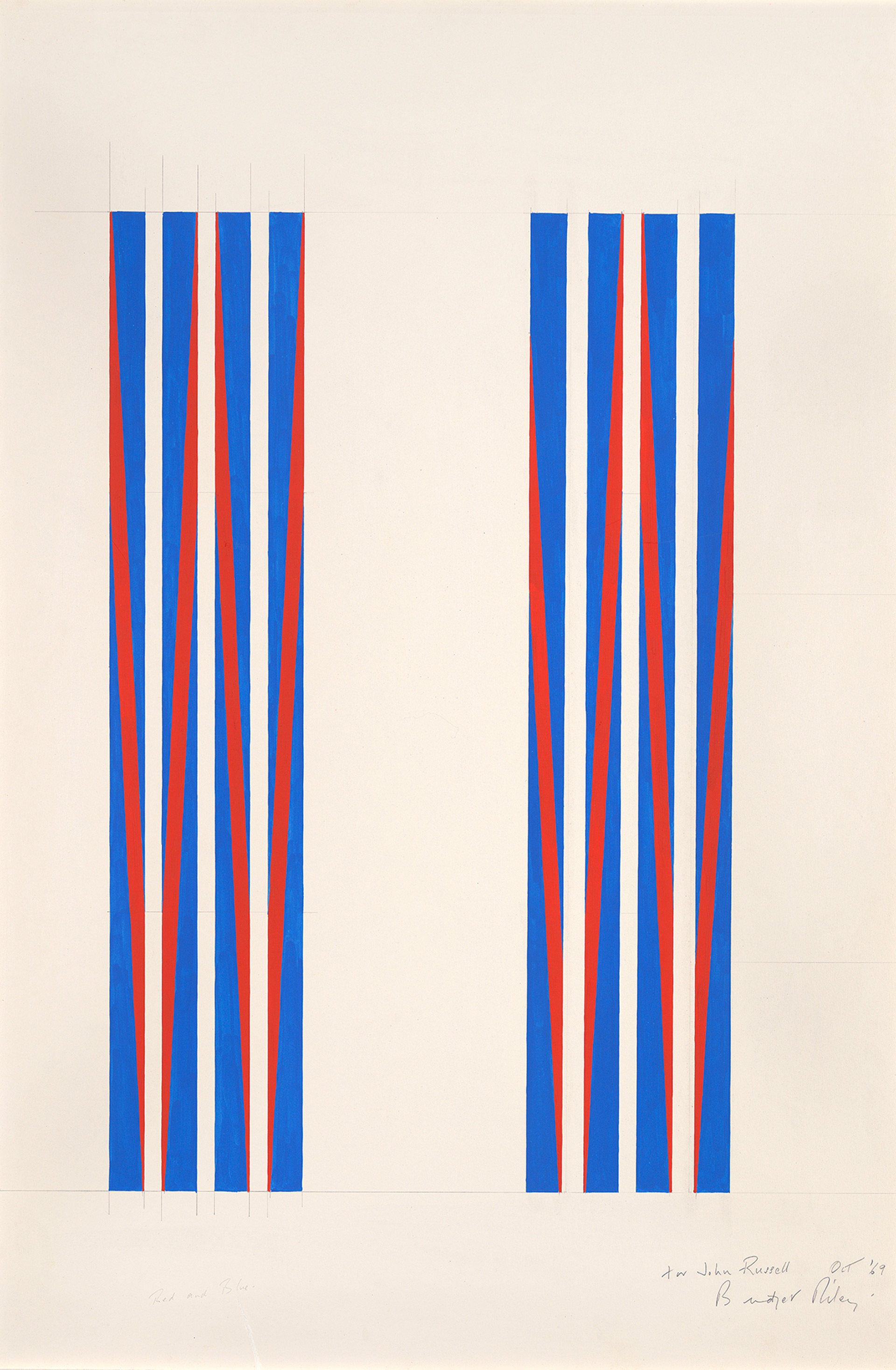
(Fig. 2) Bridget Riley, Red and Blue, 1969
Riley's support and promotion by Russell and by collector Seymour H. Knox II and patrons Burton G. and Emily Hall Tremaine were key to her success in the United States. Art enthusiasts added Riley’s work to their personal collections, encouraged friends and other collectors to purchase her pieces, published positive reviews of her solo shows, and were instrumental in organizing exhibitions featuring Riley's works.
Riley’s pieces became more accessible to a wider audience when she embraced printmaking—although, as someone who focused on painting, she was somewhat reluctant to jump into the medium. Riley did not at first envision how prints would fit into her process. Her earliest works on paper were the gouache and graphite studies that littered her studio. These were integral to the way she worked and provided direction to her assistants for assembling a painting. How would prints, specifically screen prints, figure into Riley’s practice?
In the early 1960s, screen printing was a cutting-edge process, and it quickly became popular among Riley’s British contemporaries. Her peers experimented with the medium, producing iconic works such as Eduardo Paolozzi’s As Is When series (1964–65) and Richard Hamilton’s Adonis in Y Fronts (1963). Riley eventually turned to printmaking after Movement in Squares (1961), an early black-and-white painting, was shown at Gallery One in 1962, her first solo exhibition. Following suggestions that she should make a print after the painting to make the work more widely accessible, in 1962 Riley produced an edition of twenty-six untitled screen prints (originally called Print 1).(3) The prints sold out by the end of the month-long exhibition.
Encouraged by the success of this first series, Riley embarked upon making additional prints. She describes the inspiration behind the series that would become known as Fragments (1965):
During the preparatory work for a painting, I may make images which are tangential to the problems posed by the particular painting. Some of these images I return to and develop later, others remain as fragments of a theme. These prints are a selection from such fragments in my folios and cover a period from 1962 to 1965.(4)
In Fragments, each print represents the spark of an idea that Riley might later return to and expand upon—sometimes decades later. Compare, for example, Untitled [Fragment 6] (1965) with White Discs 3 (2019/1964; figs. 3, 4).(5) These are nearly identical works executed sixty-five years apart.
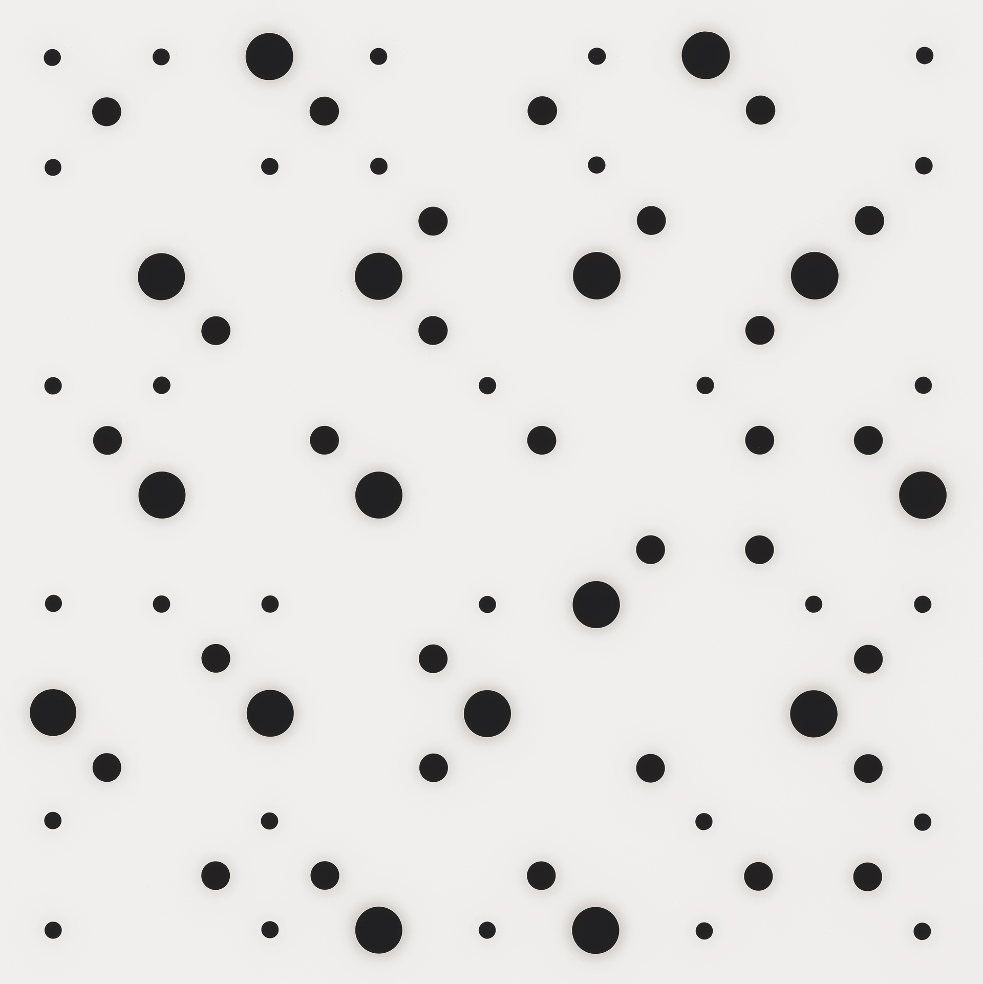
(Fig. 3) Bridget Riley, Untitled [Fragment 6], 1965
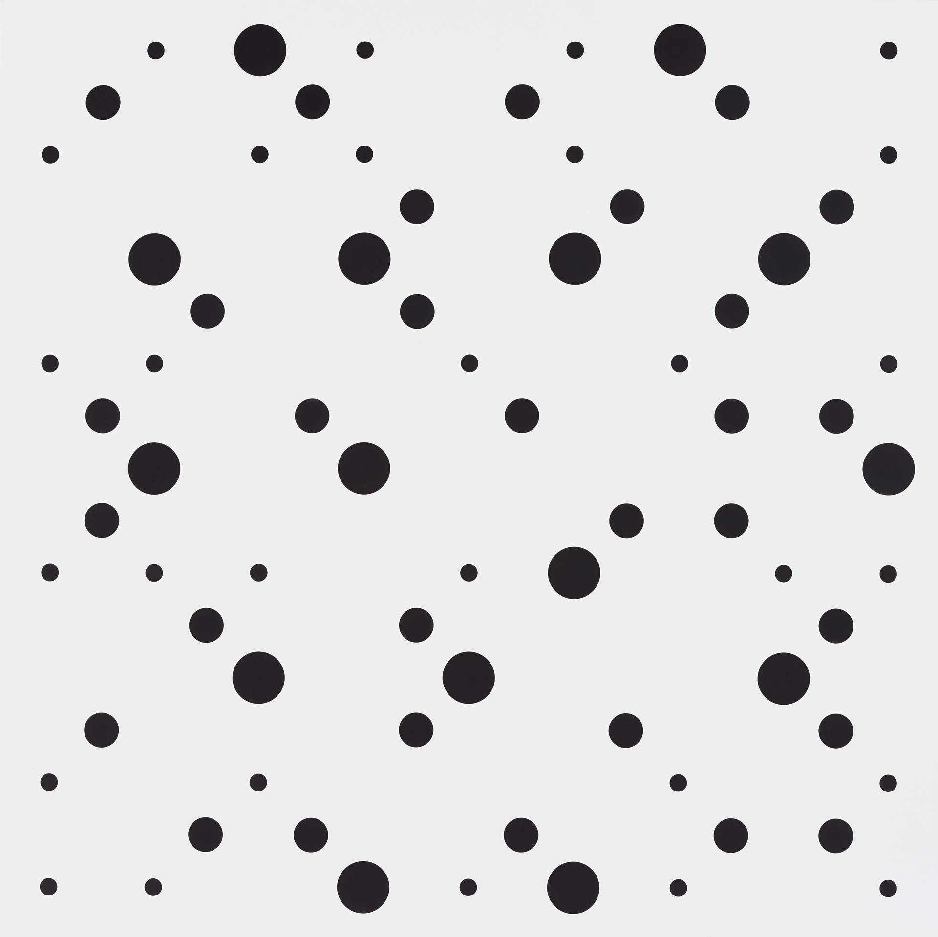
(Fig. 4) Bridget Riley, White Discs 3, 2019/1964
Other examples include Untitled [Fragment 2] (fig. 5), which, although not similar, relates to the paintings Fall (1963), Polarity (1964), Crest (1964), and Current (1964) (fig. 6).(6) The Fragment print series, made while Riley was “considering the tensions found in the tight and loose undulations of lines,”(7) bridged the gap between the studies Riley made in her studio and the finished, large-scale paintings that followed—helping her realize how prints could fit into her process.
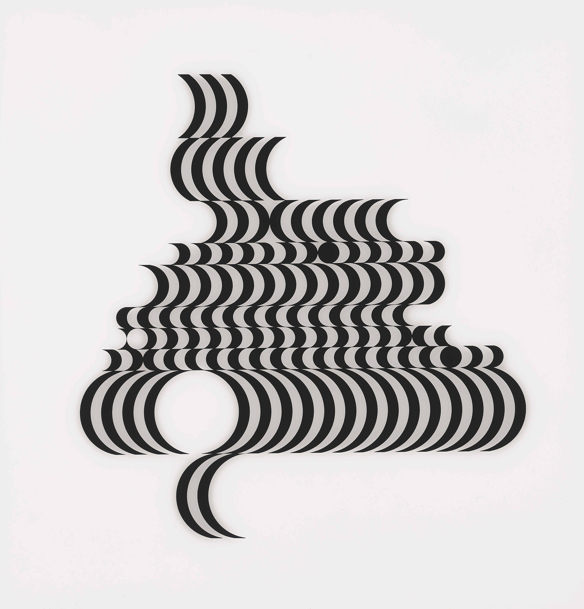
(Fig. 5) Bridget Riley, Untitled [Fragment 2], 1965
(Fig. 6) Bridget Riley, Current, 1964
Fragments was a new experience not only for Riley but also for Kelpra Studio, the printers with whom she worked, because the artist wanted to use what was then an unusual material: Plexiglas. Founded in 1957, Kelpra quickly grew from a small operation into the ideal studio to work with for Pop and Op artists.(8) Artists like Hamilton, R. B. Kitaj, and Joe Tilson would flock to Kentish Town in northwest London to work with the studio. Riley was introduced to Kelpra when, in 1964, she was one of twenty-four artists asked to contribute a screen print to the Institute of Contemporary Art’s portfolio, along with Peter Blake, Hamilton, Hodgkin, and others. She would continue to work with Kelpra for nearly a decade after this project.
When Riley brought her idea for Fragments to the studio, no one had experience with printing on plastic, and a commercial printer was needed to assist. This practice of asking her printers to engage in new techniques would become a hallmark of Riley’s career. And given that, in her opinion, “personal autography was so immaterial to the realization of the concept,” Riley would not only routinely hand off her paintings to assistants to complete but also trusted the studio to ink and pull her prints.(9)
In 1962, Riley attempted to introduce color but struggled with disrupting the balance and binary nature of her black-and-white compositions (her oeuvre at the time).(10) She began by introducing gray—the tonal space between black and white—which would become a means of transitioning into true color. As Riley stated, this “fluidity of grey movements and its capacity to bridge the light/dark contrast allowed [her] to keep a door open for colour.”(11) She adds, “I had to work through the Black and White paintings before I could even begin to think about possibilities of colour.”(12)
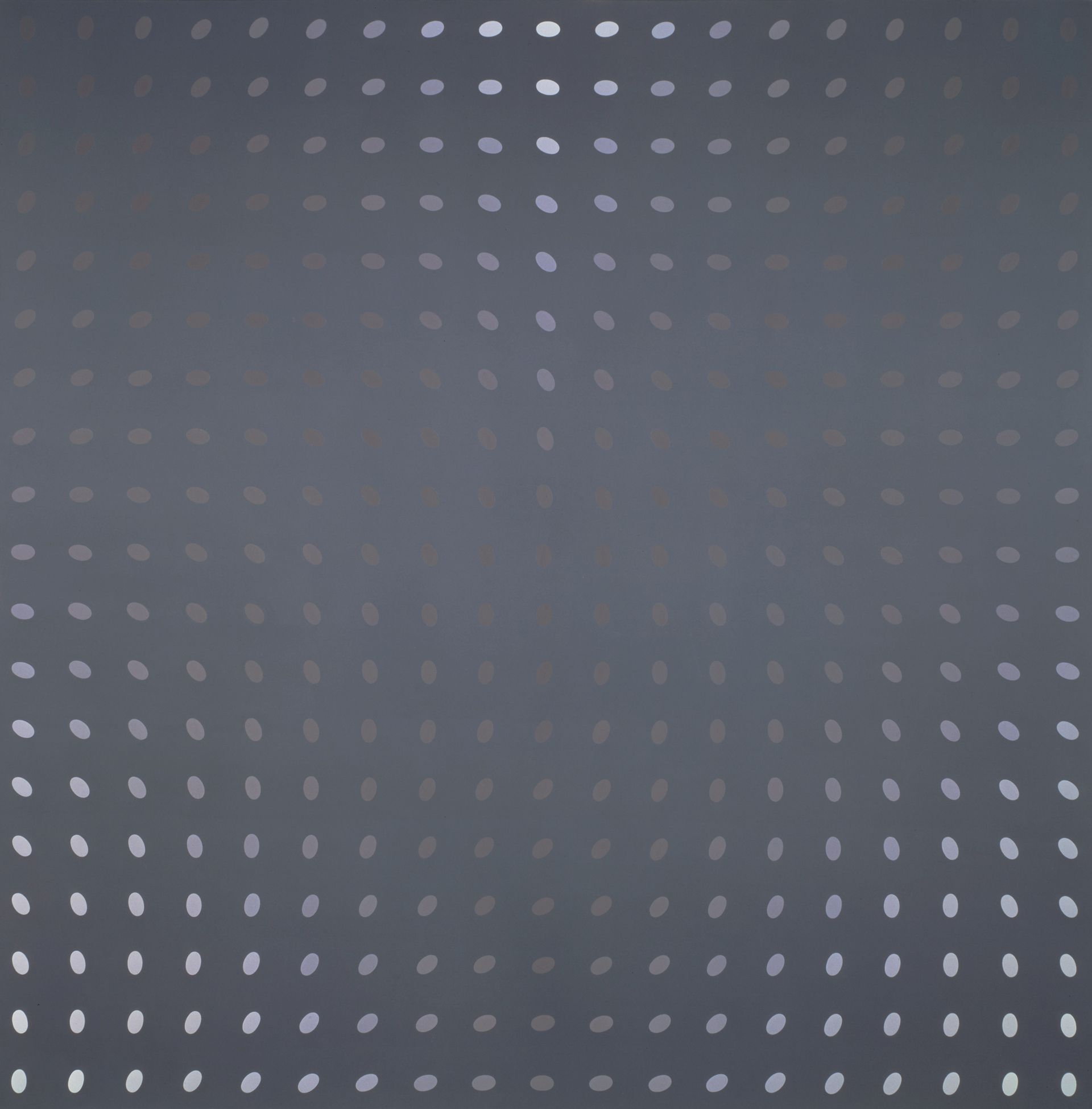
One of Riley’s most complex uses of tonality is her Deny painting series (1966) (fig. 7).(13) Robert Kudielka has theorized that Deny and the print series Untitled (Nineteen Greys A, B, C, and D) (1968) (fig. 8)(14) are based upon a denial of compositional norms, writing that each “image rests upon a regular grid which is denied, in linear terms, by the directional flow of the ovals.”(15) He continues, “This flow, in turn, is countered by the tonal sequence from light to dark; and inbuilt into the tonal situation is the polarity between warm and cold (the grey of the ground being opposed to the grey of the ovals)."(16) The elements of the composition all oppose one another, but at the same time draw each other out. Gene Baro also described the series as “a living balance of forces, a pause that says everything.”(17)
(Fig. 7) Bridget Riley, Deny 1, 1966
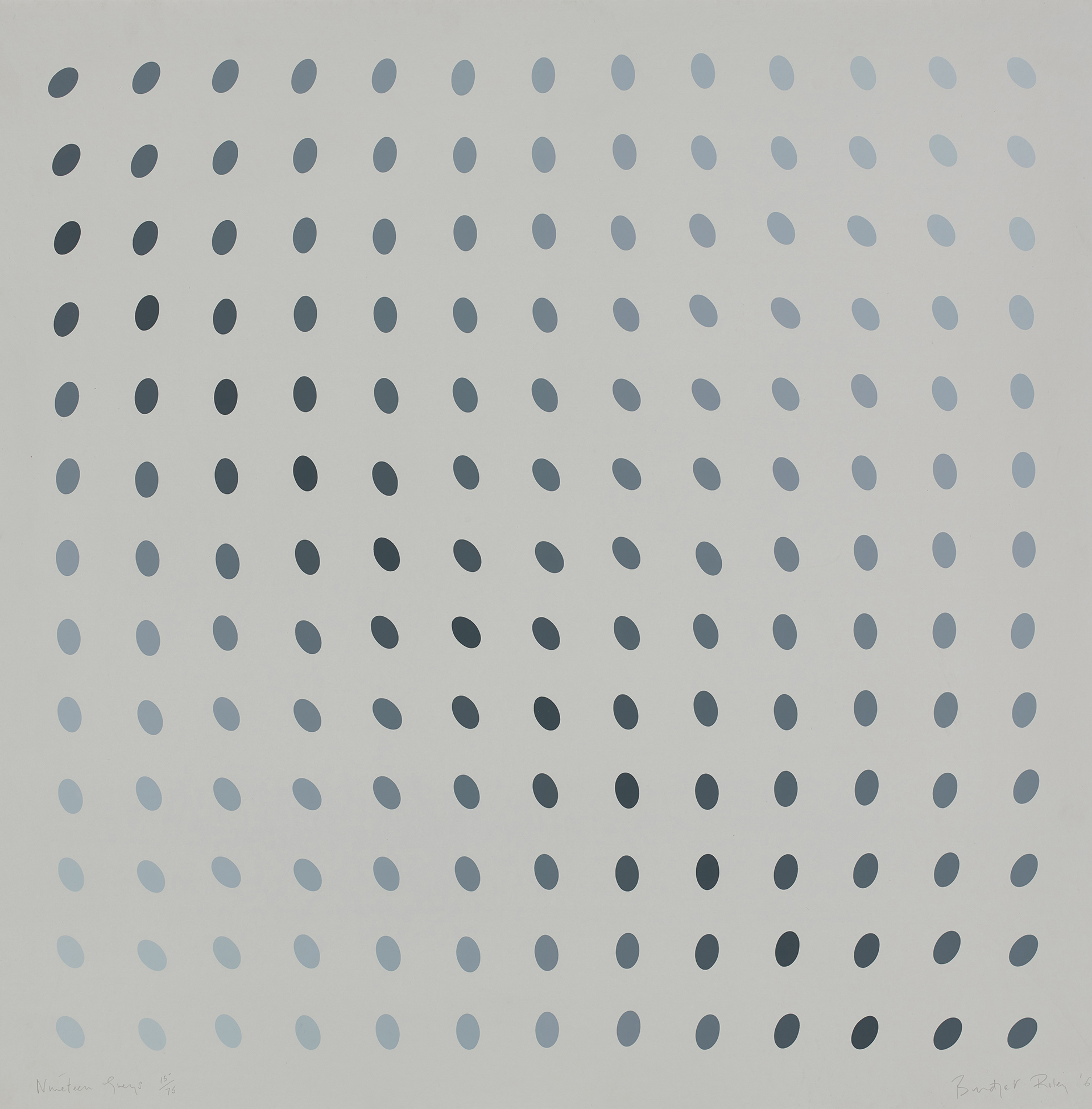
(Fig. 8) Bridget Riley, Untitled [Nineteen Greys B], 1968
So much of Riley’s work is about this balance of forces. In an interview with Kudielka, Riley discussed why her paintings on tonality are so visually effective:
Those paintings are not so much about contrast, or colour for that matter, as about tone—tone in its purest sense. Deny and Drift, for instance, were built on an inversion of colour and tone. When the tonal values are equal you can clearly see the colour opposition between the dull red and blue. Conversely when the tonal contrast is at its strongest the difference in hue is overpowered by the opposition of light against dark.(18)
In her black-and-white works, Riley knew that anything other than gray would disrupt the balance, but her ultimate goal was to break away from binary compositions. As with the Deny paintings, flashes of red and blue appear in Untitled (Nineteen Greys A, B, C, and D). As one gazes at the prints, whether in person or in reproduction, different shades of color become visible, and the powdery gray tones transform before one's eyes.
Because screen printing can be used in a variety of ways, it appealed to Pop artists, who were searching for new ways to replicate commercial imagery. Paolozzi, Hamilton, and Andy Warhol gravitated toward the medium because it allowed them to incorporate photographs and create collage-like work. Screen printing also lends itself to the layering of line, form, and color (the basic elements of an artwork), which is what drew Riley, Victor Vasarely, and Josef Albers to it—in order to experiment with the optical effects and relationship of colors in their paintings and drawings.
The crisp lines and boundaries between different colors were perfect for both Riley and Albers, two artists extremely interested in color theory and relationships. In a screen print, there is no bleeding or blending, so the artwork can accurately represent the relationship between two, three, four, or more colors. Riley and Albers also realized that the most important aspect of a work of art is its relationship to the viewer. As Albers put it, color “is almost never seen as it really is” and “deceives continuously.”(19) Two years later, Riley similarly expressed that “perception is the medium through which states of being are directly experienced.”(20)
For these artists, whose work depended on the viewer’s perception, every line, color, and angle had to be perfect, and screen printing demanded and allowed the closest thing to perfection. The registration of layers had to be exact; otherwise, the errors would be too visible and obvious. Although there are many other printmaking techniques, none is as precise as screen printing.
Screen printing turned out to be a useful technique for Riley to explore tonal gradation, allowing her to experiment with overprinting with varying degrees of precision. She would supervise as the Kelpra assistants ran several prints at once and made minute changes to the ink color or alignment of screens until the images were just right. As with Fragments, Riley’s series Untitled (Nineteen Greys A, B, C, and D) would push printers to new levels of technical proficiency—it took five hundred runs and a full year to achieve the seventy-five prints for the edition.(21) The color combinations were ultimately achieved with such care and delicacy that distinguishing them as prints (rather than paintings) is a challenge.(22)
After 1967, color would have a more prominent role in Riley’s work, with gray often becoming the ground color. One project that exemplifies this evolution is Coloured Greys 1, 2, 3 from 1972—three prints made up of a combination of gray, green, blue, and orange curved lines on a white ground. Other prints from the 1970s signaled a transformation in the use of colored lines and forms. These include Splice (1975), with its pattern of elongated triangles, Green Dominance (1977), Orpheus, study 6 (1977) (fig. 9), and the series Untitled (Blue, Bronze, Rose) (1978), all composed of undulating, toffee-like stripes (fig. 10).(23)
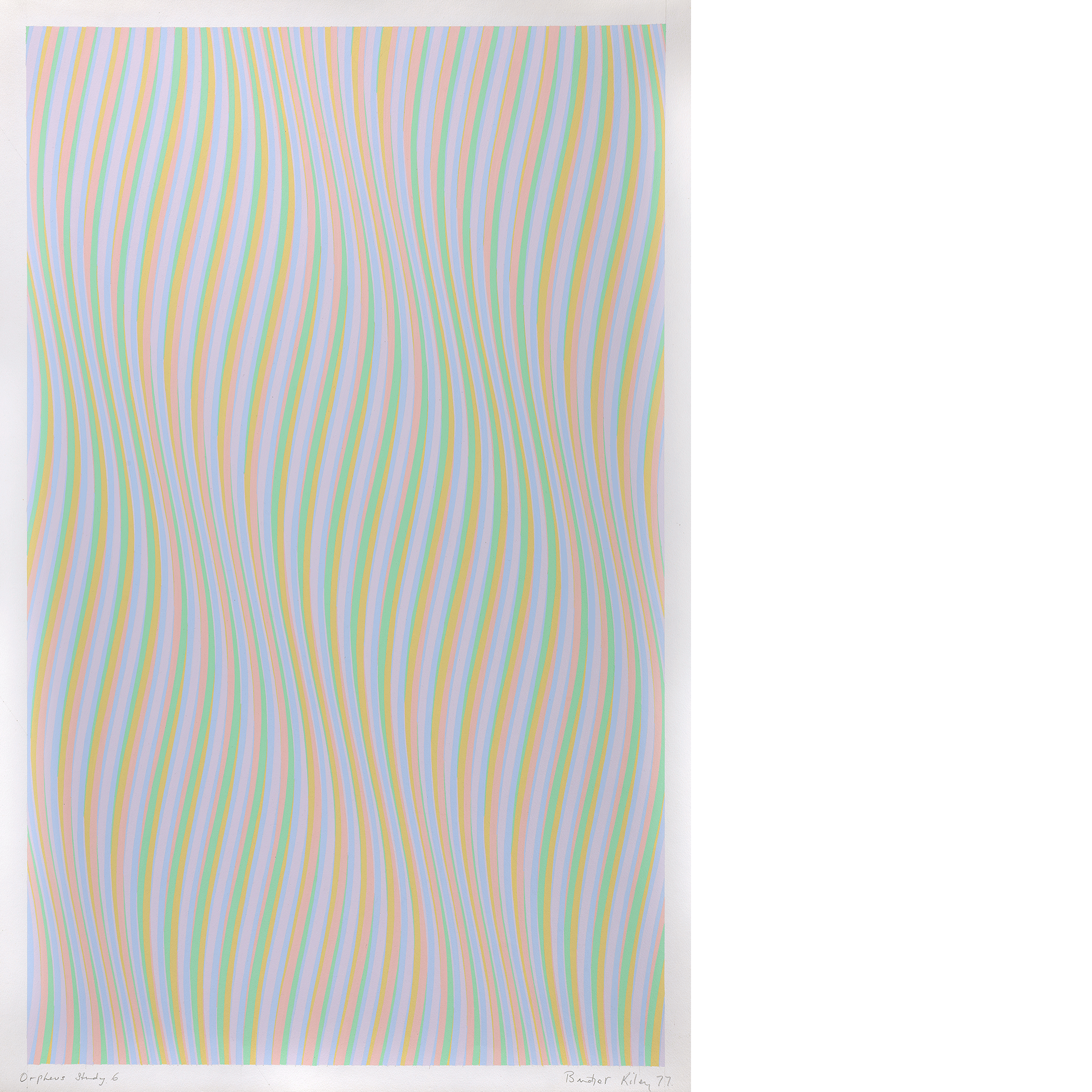
(Fig. 9) Bridget Riley, Orpheus, study 6, 1977
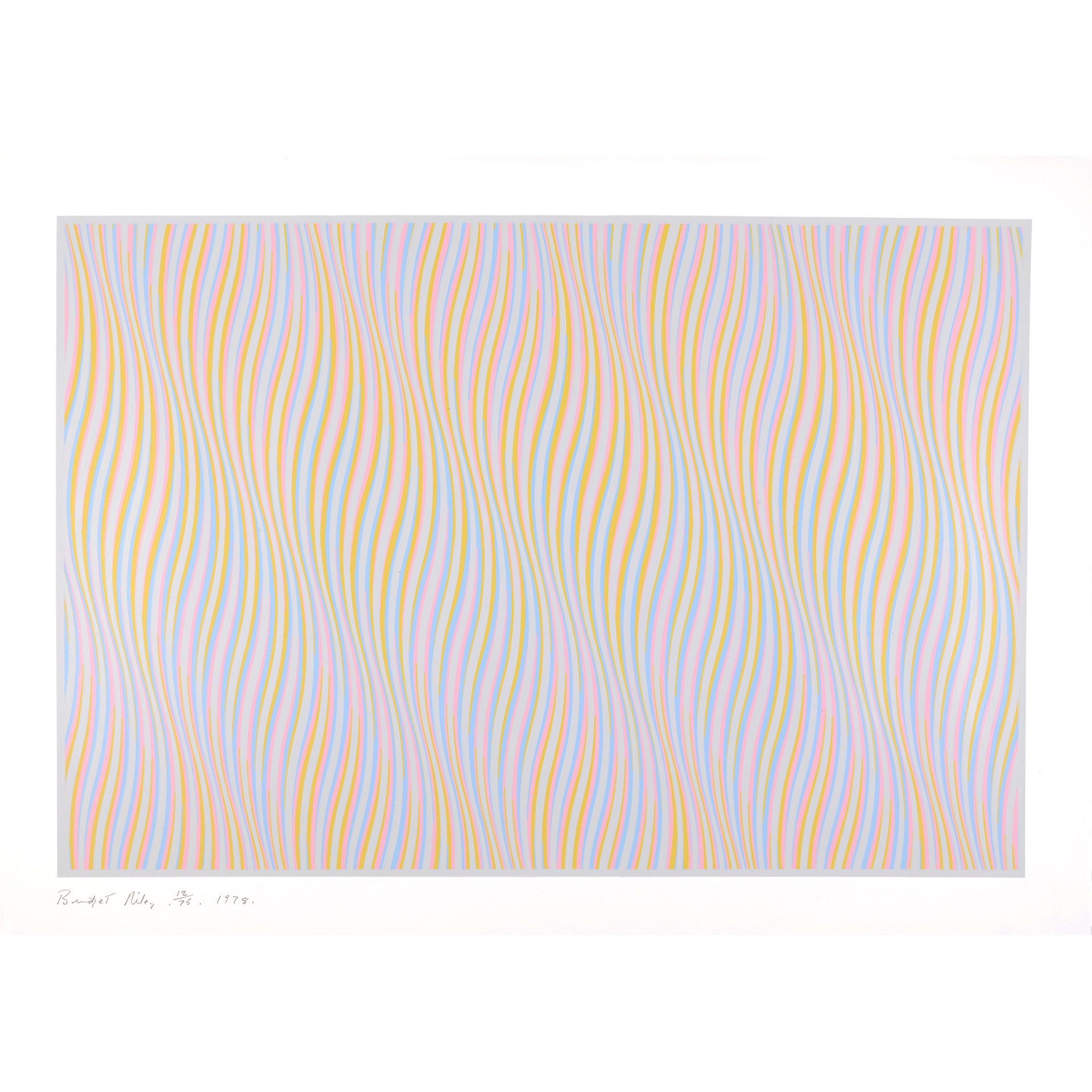
(Fig. 10) Bridget Riley, Untitled [Rose], 1978
Following a productive decade of printmaking in the 1970s, Riley created only two prints in the 1980s: Silvered 2 and Ra 2 (both from 1981; figs. 11, 12).(24) She later stated that these two prints were made “to prove something about colour which to many people seems to be unbelievable: that the same hues put in different juxtapositions, can produce such very diverse sensations.”(25) The prints were made using the exact same number of colored lines, which she listed at the bottom of each (twenty-one reds, twenty-one blues, twenty-four turquoises, twenty-four yellows, nine blacks, eight whites). Their arrangements are different, however, creating two distinct compositions. Ra 2 has a grouping of turquoise and blues at the left and right, and a slight flourish of yellow and red near the center, whereas the stripes in Silvered 2 are placed at near-regular intervals, making the image feel balanced. Riley described these prints as “the closest I’ve come to Conceptual art—the paintings weren’t about making that point but the prints were.”(26)
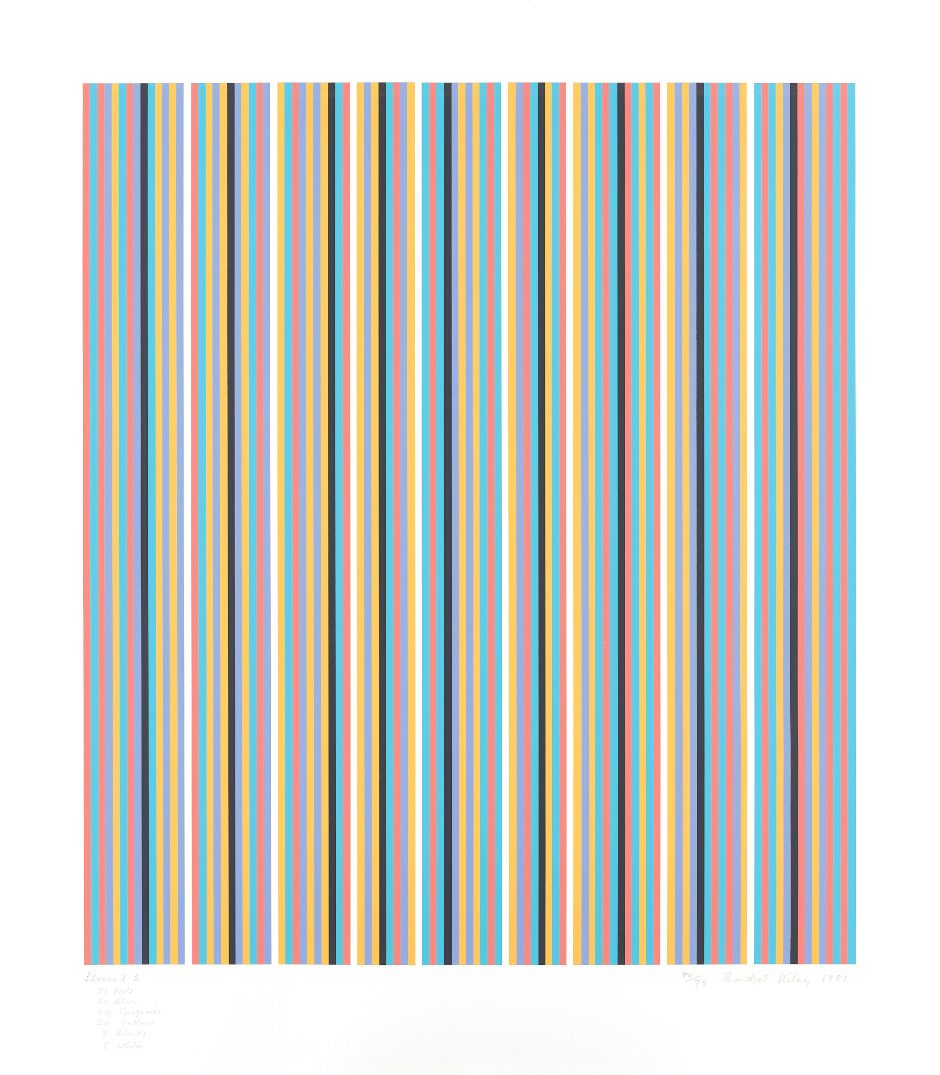
(Fig. 11) Bridget Riley, Silvered 2, 1981
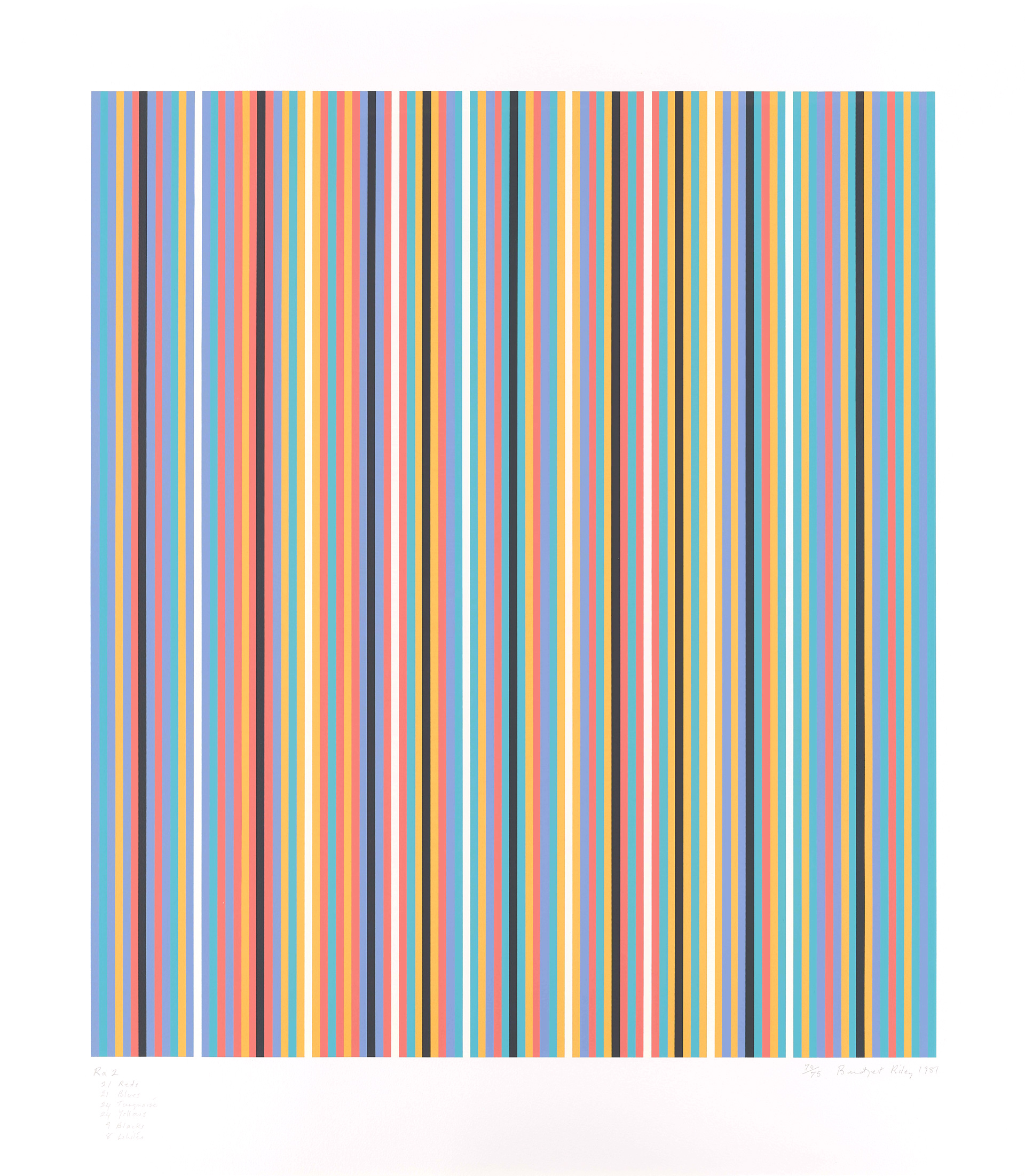
(Fig. 12) Bridget Riley, Ra 2, 1981
The reason Riley pursued this project in print rather than painting relates to her process and her view of each medium. Riley executes a painting only once she feels that she has achieved the concept in her studies; only then are her studio assistants given instruction on how to create the painting. The studies used internally in the studio are also important for understanding Riley’s practice. Graphite notations and corrections crowd the pages, communicating to her studio assistants how to arrange the colors in the composition or to change one or two of them.
Riley would lay painted pieces of paper next to each other to better understand how the colors would interact and, in this way, avoid executing a brand-new study each time. Ra 2 and Silvered 2 were probably planned using this method and were never meant to be “finished products.”(27) Instead, they were intended to illustrate one of the most unique features of Riley’s work: the relation of colors to one another.
Riley’s attention to detail is staggering, but her use of studio assistants is intentional. She feels strongly that she cannot, and should not, be the one to put paint to canvas: “Any trace of a personal gesture, however slight, would interfere with the purity of color, and distract from the perception of that indefinable luminosity which pervades the whole.”(28) Riley has taken this same approach when making screen prints. Printmakers with whom Riley has worked include Chris Betambeau, Graham Henderson, and Bob Saich, who all started at Kelpra. Since the early 1980s, Riley has also worked with Sally Gimson and her staff at Artizan Editions; Gimson and her assistants printed nearly 80 percent of Riley’s prints from 1981 to 2012.(29)
Although she was initially reluctant, Riley's decision to explore printmaking turned out to be essential to her practice. It allowed her to try things she would not have been able to achieve with paint on canvas alone. She printed on unexpected supports, like Plexiglas, and achieved fine tonal contrasts, as in her Nineteen Greys series. For her paintings, Riley mixes her own colors so that the combinations on canvas create the sense of movement or optical stimulation she seeks. Screen printing was the only printmaking technique that could work in the same way.
Although she has made relatively few large-scale paintings, Riley’s prints number in the thousands, making them far more accessible to a larger collecting audience. She sometimes gave her gouache studies and prints to friends and patrons, as with the gifts to Russell.(30)
Charlotte Lefland, Senior Curatorial Assistant, Prints and Drawings, Yale Center for British Art, 2022.
